Let Calm Glow: Layered Ambient Lighting for a Refined, High-End Home

Discover how layered ambient lighting dissolves harsh edges, settles the mind, and elevates everyday moments into quiet rituals. We’ll blend indirect washes, discreet downlights, and sculptural accents, balancing color temperature, dimming curves, and reflection to create serenity without sameness. Along the way, expect practical specs, designer anecdotes, and scene ideas you can install today. Share your questions and subscribe to receive our room-by-room checklist.

The Quiet Power of Layers

Great lighting starts with layers that breathe together. Think of a gentle base glow, nuanced vertical illumination, and restrained accents guiding the eye. The aim is soft contrast, not brightness for its own sake. We’ll map lux targets, discuss vertical-to-horizontal ratios, and show how walls, ceilings, and art quietly collaborate. Try the exercises, then comment with your observations; our team replies with personalized tips for your floor plan.

01

Ambient Foundations

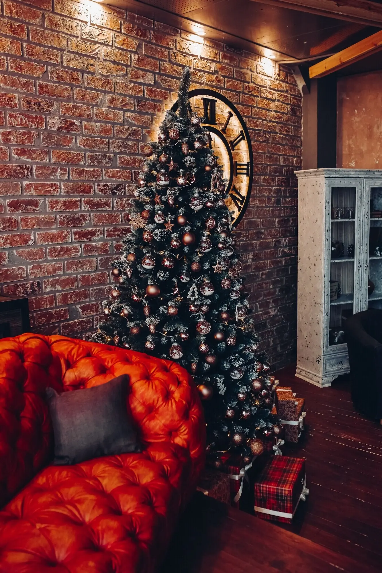
Set a calm baseline at roughly 100–150 lux in living areas, achieved through broad, indirect sources that lift ceilings and bathe walls. Aim for uniformity without flattening texture by prioritizing vertical illumination. Choose warm 2700–3000K light, CRI 90+ or ideally 95+, and keep glare under control with deep regress or diffusers. Share your room dimensions below, and we’ll help estimate lumen needs and fixture spacing.

02

Soft Contours and Washes

Use wall washers and concealed coves to create gentle gradients that smooth corners and amplify perceived spaciousness. A narrow beam on textured plaster adds depth without shouting. Keep distances from walls consistent to avoid scallops. If ceilings allow, slot-in linear LEDs with opal lenses create luxurious, cloudlike halos. Post a photo of your wall finish, and we’ll suggest beam spreads and mounting offsets tailored to your surfaces.

03

Balancing Contrast and Comfort

High-end calm relies on gentle contrast ratios, often around 1:3 between focal and surrounding areas, keeping pupils relaxed and details legible. Position accent lights to avoid hotspots directly within sightlines. Add low-level floor washers for night paths. Test scenes at dusk, then dim to the edge of visibility. Comment with your favorite setting names, and we’ll share pro presets for reading, dining, and late conversations.

Choosing Sources that Disappear

Fixtures should serve the architecture, not steal the spotlight. Favor minimal trims, micro-downlights, and concealed linear profiles paired with quality drivers. Look for serviceable products with L70 lifetime beyond 50,000 hours and replaceable components. Prioritize CRI 95+ where art or skin tones matter. If you love object drama, let one sculptural piece carry the narrative. Ask questions about brands and dimming protocols, and we’ll compare real-world performance.

Color, Fidelity, and Mood

Clever color temperature choices steer the nervous system toward ease. Use 3500K for focus by day, then shift to 3000K or 2700K as evening unfolds. High CRI or, better, TM‑30 scores with balanced Rf and Rg preserve materials honestly. Avoid flicker by specifying low ripple drivers. Consider tunable white for nuanced rituals. Comment with your daily rhythm, and we’ll draft scene timelines personalized to your habits.
Dim-to-warm LEDs trace an incandescent curve, drifting from 3000K toward 1800–2200K as brightness lowers, signaling rest. Pair this with indirect sources to prevent visual fatigue. Night routines benefit from floor-level guidance at ultra-low levels. Add candlelight on weekends for tactile charm. Share how you unwind after work, and we’ll suggest coordinated settings that calm without dulling the richness of materials or beloved art.
Select sources with CRI 95+ and strong R9 values to honor wood tones, textiles, and skin. TM‑30 helps evaluate gamut; aim for balanced Rf/Rg near 90/100 for believable depth. Color consistency matters room to room. When framing artwork, test side by side under different lamps. Post a snapshot of fabrics or paint chips, and we’ll recommend spectra that protect subtle hues and prevent plasticky, flat impressions.
Quality dimming eliminates stroboscopic distraction and supports relaxation. Specify ELV, 0–10V, or DALI with compatible drivers and verify minimum dim levels below one percent without visible steps. Try preset fades of five to ten seconds for scene transitions. Avoid audible drivers in quiet rooms. Tell us your control platform, and we’ll share wiring diagrams and tested pairings that keep operation whisper-quiet and consistently luxurious.

Room-by-Room Layering

Every room asks for a distinct ratio of ambient, task, and accent, yet a cohesive thread keeps the home calm and elevated. We’ll walk through living, bedroom, and kitchen strategies, touching halls and baths too. Expect realistic targets, mounting tips, and substitution notes for low ceilings. Reply with one space you’re updating, and we’ll prioritize detailed advice in our next walkthrough.

Intuitive Scenes and Control

Luxury feels effortless when control fades into the background. Use etched keypads with meaningful labels, adaptive dimming schedules, and occupancy sensors tuned thoughtfully. Create scenes like Welcome, Dinner, Reading, and Late Night, each with gentle fade times. Integrate daylight response where windows glow. Curious about Lutron, KNX, or HomeKit? Comment with your ecosystem and we’ll outline reliable paths from wireless starters to whole-home precision.

Scenes that Teach Calm

Name your scenes intentionally to reinforce mood. A Dinner scene might favor warm wall-wash and shaded lamps, while pendants dim low over the table. Welcome can open pathways and artwork at modest brightness, never blinding. Late Night should glide to candle-warm levels. Share your preferred labels, and we’ll recommend fade durations and interlocks that prevent startling changes when someone taps a keypad unexpectedly.

Smart Without the Noise

Choose a control ecosystem that matches your tolerance for tinkering. Wired backbones offer reliability; well-chosen wireless can be elegant for apartments. Prioritize scene simplicity over endless sliders. Disable beeps and bright LEDs on devices. Protect privacy with local processing when possible. Tell us about your household, and we’ll propose a control map that feels invisible yet dependable for guests, kids, and nightly routines.

Harnessing Reflectance

Target light colors around 0.7–0.85 reflectance for ceilings and upper walls to amplify ambient layers gently. Medium woods and stones can ground the palette without swallowing glow. Test with sample boards under your actual fixtures. Observe vertical brightness more than horizontal. Share a quick measurement of room finishes, and we’ll calculate expected luminance balance and suggest tweaks that keep everything calm, legible, and quietly luxurious.

Finish Matters

Select matte or eggshell paints to minimize specular glare, reserving satin for durable trims. Fabric shades should diffuse evenly, avoiding hot spots from bare bulbs. Brushed bronze, patinated brass, and honed marble respond beautifully to warm light. If gloss is desired, limit its field of view. Describe your preferred materials, and we’ll propose finish combos that elevate glow while resisting fingerprints, dust, and visual fatigue.

Hidden Glare Control

Comfort hinges on shielding light sources from direct view. Use baffles, louvers, and deep regressed trims to shape cut-off angles. Specify UGR-friendly optics where sightlines stretch across spaces. Layer light vertically to avoid bright floors. Adjust dim levels for night. Send a photo of critical viewpoints, and we’ll advise shielding strategies that protect comfort while preserving crisp highlights and measured, luxurious sparkle.
Lomarivemazake
Privacy Overview

This website uses cookies so that we can provide you with the best user experience possible. Cookie information is stored in your browser and performs functions such as recognising you when you return to our website and helping our team to understand which sections of the website you find most interesting and useful.